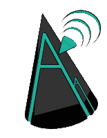
I used the a concept from the official ADAM logo, the Wi-Fi symbol. I also made the text out of lines, and the brush tool, not using the text tool. You could use a concept from McDonalds, but use it in a creative new way. You cannot use a concept that looks exactly like the original.
EDIT:
There, I guess there was some pixels left over, and when I uploaded the logos, it created a outline around the final product.


I think the use of shapes and shading is really interesting. It's a great design. Something I would improve on is just some minor imperfections. I would get rid of them by using the eraser tool to erase unwanted lines.
ReplyDeleteWhat I like about your project is how you made triangle pieces in the circle, instead of just leaving it a circle, its creative. What I feel you can improve is making the "Alphas" more noticeable in the logo. You can do that by making your lines maybe a little more thicker and bigger. :)
ReplyDeleteThis logo was AMAZING. i love how the wifi signal is being sent out, almost like a satellite dish. The use of the lettering and colors were very affective. i feel for improvement you could remove the word Alpha on the side. Part of the assignment was that no text could be used.
ReplyDeleteThis is really good because you used custom shape and it's not copyrighted. The design is genius. Can you, like, you know, join the Royal Tacos. To improve this, I wouldn't make the bottom rigid by using the magnetic lasso tool.
ReplyDelete10/10 would set as our team's desktop backgrounds. It looks awesome! Only thing I would change is that it badly needs to be Anti-Aliased. This could be done by making it larger in proportion to the background, as well as saving it as a larger resolution. Besides that it is by far the best one out of the group!
ReplyDeleteI like the designs of the shapes and how you did all three projects. One thing I would change are the little gaps in the shapes.
ReplyDeleteI think it looks great, however there are tiny black specks at the bottom of two of the logos. You can simply erase them to fix it.
ReplyDeletewhat I like about this logo is that it is kind of plain and simple . What I think could be better is not having the random lines all over and you could use the eraser tool to fix them.
ReplyDeleteI actually believe this is too complex for a logo. The second one is more simple, and seems more suitable for a logo design. Overall the design looks great, but you should use the eraser tool to get rid of the lines you don't want to use.
ReplyDelete